


Odd-Fish Art Update #3
December 17, 2009
« The Order of Odd-Fish Mix Interview With Someone Who Hated Odd-Fish »

|
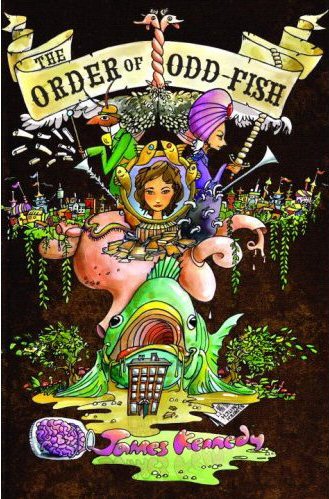
Max Pitchkites has hit the home stretch of his astonishing mixed-media illustrations for The Order of Odd-Fish (check out the complete series so far). It’s going to be a highlight of the Odd-Fish art show we’re putting on in April 2010.
This one above is a new favorite—the final moment of the Schwenk-hunt in Chapter 15. I love the triumphant swirling energy of the Schwenk as he corkscrews through the sky, but the masterstroke was to render the awestruck, gobsmacked citizens of Eldritch City as multicolored silhouettes. It’s beautiful!

|
Above, Max has put together an annotated map of Eldritch City to illustrate the series of disconnected adventures of Chapter 14. (Fantasy books have to have maps, right? It’s a rule.) Brilliant idea to include Jo’s personal footnotes and marginalia, including events from outside the chapter, like the pig-icon for the zoo (”I will never go to a nangnang exhibit there. EVER”). Max also writes, “The kanji on the orange continent means ‘festival’ (provided the internet didn’t lie to me) since Eldritch City and its festivals are based on Japan and its festivals.”
I like how elements, themes, and in-jokes repeat and develop throughout this series, as when Max says, “The Mario mushroom houses reappeared from On Their Way (Chapter 11), and since that’s from a Nintendo game, I decided to make the Muncipal Squires’ Authority shaped somewhat like the Temple of Time from the Legend of Zelda Games (Ocarina of Time version especially) since the MSA headquarters lies within a dilapidated temple.”
The map’s worth studying for a while. It gives me ideas for new adventures in Eldritch City . . .
|
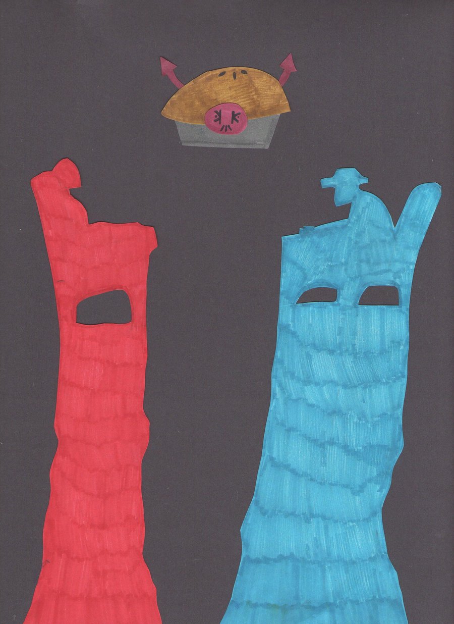
There’s something expressionistic and rather scary about this one. It’s for Chapter 16, when Ken Kiang invites Hoagland Shanks over to his Manhattan castle to discuss weighty matters of destiny and pie (step one of Ken’s evil plan to send Hoagland Shanks to hell).
In the book the meeting happens in an ordinary office, but Max explains, “I placed their chairs and desk on two precipices to symbolize the tension between the two parties, and the superimposed pie above being a mixture of their thoughts—Shanks’ thoughts of pie, and Ken’s thoughts of sending him to Hell.”
Very effective and creepy. Max complains that he doesn’t like the layered effect of the colored sharpies, but I do. It looks like those great slabs of color are sweating, or melting, only adding to the tension. Max also finds a way to work in Ken Kiang’s logo that he invented for Chapter 5 and brought out again in Chapter 6. It’s careful little touches like that which knit the whole series together in such a satisfying way.
|
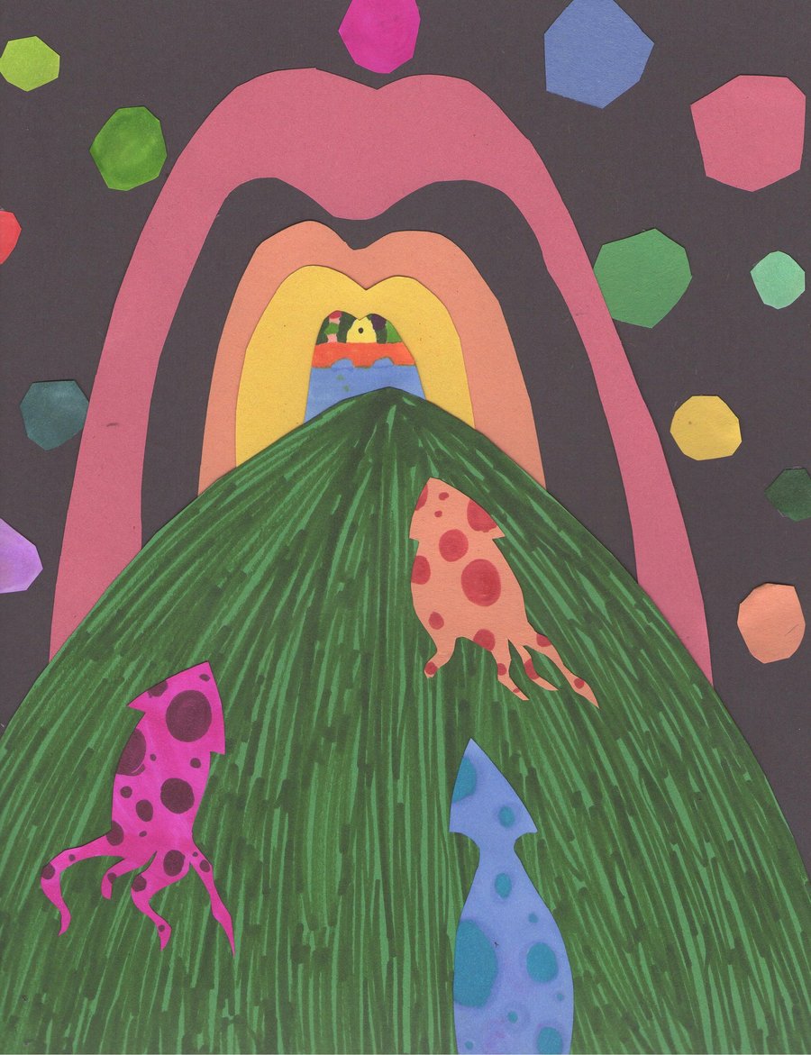
Here’s Chapter 17, when Jo, Ian, and Nick ride squids through the flooded, jewel-encrusted halls of an ancient Silent Sisters cathedral buried deep beneath Eldritch City.
Spectacular, mysterious, and irresistibly pulls the eyes forward! Max wisely just shows the squids, instead of cluttering up the composition with Jo, Ian, and Nick riding them. Max writes, “That arch you see there is really a huge mouth, and the tiny arches within being the outside world and the sunlight from outside . . . As I was making this, the mouth-arch seemed to me like a red McDonald’s arch, so I like to think of this as a Lynchian, Vasquezian ride into an underground nightmare-McDonald’s.”
Underground nightmare-McDonald’s! There’s another whole book in that little phrase—quite probably, a better one.
Max also writes that there is a “rather blatant” Easter egg hidden in the picture. Can you find it?

|
In this chapter, Nora gets a hold of some scripts from the uncannily prophetic show Teenage Ichthala and discovers the true depth and terror of the Belgian Prankster’s plans for Jo.
Scary, lurid, and weird! Max writes, “The noseless Belgian Prankster here looks like a cannibalistic hobo clown thing . . . I don’t know if this is how James envisioned him.” Yup. As usual, Max nailed it. The extreme closeup to the grotesque face, the nightmarish wash of colors, and the crammed, upside-down text give it all an unsettling vibe. You can feel the Belgian Prankster’s presence lurking behind each word of the script. The split composition is a nice reference to Max’s illustration for Chapter 25, and now that I think about it, it also reminds me of the cover of Alan Moore’s Batman graphic novel, The Killing Joke. Prankster, Joker . . . highly appropriate!
Just a few more chapters, and Max will be done. I can hardly believe it. What fantastic luck I had to meet him. Seriously, do yourself a favor and check out all his Odd-Fish work here.
And remember, artists . . . the deadline for the Odd-Fish art show is March 1! Here’s the original call for submissions.